
全栈学习笔记——HTML&CSS
HTML
References
Learn HTML: Elements and Structure Cheatsheet | Codecademy
Only content inside the opening and closing body tags can be displayed to the screen.
Understanding HTML hierarchy is important because child elements can inherit behavior and styling from their parent element.
One of the most popular elements in HTML is the <div> element. <div> is short for “division” or a container that divides the page into sections.
<div> s don’t inherently have a visual representation, but they are very useful when we want to apply custom styles to our HTML elements. <div> s allow us to group HTML elements to apply the same styles for all HTML elements inside. We can also style the <div> element as a whole.
- The
<em>tag will generally render as italic emphasis. - The
<strong>will generally render as bold emphasis.
Let’s review what you’ve learned so far:
- HTML stands for H yper T ext M arkup L anguage and is used to create the structure and content of a webpage.
- Most HTML elements contain opening and closing tags with raw text or other HTML tags between them.
- HTML elements can be nested inside other elements. The enclosed element is the child of the enclosing parent element.
- Any visible content should be placed within the opening and closing
<body>tags. - Headings and sub-headings,
<h1>to<h6>tags, are used to provide titles for sections of content. <p>,<span>and<div>tags specify text or blocks.- The
<em>and<strong>tags are used to emphasize text. - Line breaks are created with the
<br>tag. - Ordered lists (
<ol>) are numbered and unordered lists (<ul>) are bulleted. - Images (
<img>) and videos (<video>) can be added by linking to an existing source.
Here are a few more resources to add to your toolkit:
- Preview: Docs HTML, short for HyperText Markup Language, is the foundation of all web pages. It was created by Tim Berners-Lee in 1993 to define the structure of a web page.Codecademy Docs: HTML
- Codecademy Workspaces: HTML
- https://www.youtube.com/watch?v = uxmB8MlO3m8
The <!DOCTYPE html> declaration provides the browser with two pieces of information (the type of document and the HTML version to expect), but it doesn’t actually add any HTML structure or content.
Anything between the opening <html> and closing </html> tags will be interpreted as HTML code. Without these tags, it’s possible that browsers could incorrectly interpret your HTML code.
The <head> element contains the metadata for a web page. Metadata is information about the page that isn’t displayed directly on the web page. Unlike the information inside of the <body> tag, the metadata in the head is information about the page itself.
This attribute stands for hypertext reference and is used to link to a path, or the address to where a file is located (whether it is on your computer or another location). The paths provided to the href attribute are often URLs.
<a href="https://www.wikipedia.org/">This Is A Link To Wikipedia</a> |
The target attribute specifies how a link should open.
It’s possible that one or more links on your web page link to an entirely different website. In that case, you may want users to read the linked website, but hope that they return to your web page. This is exactly when the target attribute is useful!
For a link to open in a new window, the target attribute requires a value of _blank. The target attribute can be added directly to the opening tag of the anchor element, just like the href attribute.
<a href="https://en.wikipedia.org/wiki/Brown_bear" target="_blank">The Brown Bear</a> |
Thankfully, HTML allows you to turn nearly any element into a link by wrapping that element with an anchor element. With this technique, it’s possible to turn images into links by simply wrapping the element with an <a> element.
<a href="https://en.wikipedia.org/wiki/Opuntia" target="_blank"><img src="https://www.Prickly_Pear_Closeup.jpg" alt="A red prickly pear fruit"/></a> |
In order to link to a target on the same page, we must give the target an id attribute and a unique value like this:
<p id="top">This is the top of the page!</p> |
Let’s review what you’ve learned this lesson:
- The
<!DOCTYPE html>declaration should always be the first line of code in your HTML files. This lets the browser know what version of HTML to expect. - The
<html>element will contain all of your HTML code. - Information about the web page, like the title, belongs within the
<head>of the page. - You can add a title to your web page by using the
<title>element, inside of the head. - A webpage’s title appears in a browser’s tab.
- Anchor tags (
<a>) are used to link to internal pages, external pages or content on the same page. - You can create sections on a webpage and jump to them using
<a>tags and addingids to the elements you wish to jump to. - Whitespace between HTML elements helps make code easier to read while not changing how elements appear in the browser.
- Indentation also helps make code easier to read. It makes parent-child relationships visible.
- Comments are written in HTML using the following syntax:
<!-- comment -->.
Take some time to edit the workspace you created and observe how it changes!
|
|
Table
In HTML, you can add data using the table data element: <td>.
Let’s review what we’ve learned so far:
- The
<table>element creates a table. - The
<tr>element adds rows to a table. - To add data to a row, you can use the
<td>element. - Table headings clarify the meaning of data. Headings are added with the
<th>element. - Table data can span columns using the
colspanattribute. - Table data can span rows using the
rowspanattribute. - Tables can be split into three main sections: a head, a body, and a footer.
- A table’s head is created with the
<thead>element. - A table’s body is created with the
<tbody>element. - A table’s footer is created with the
<tfoot>element. - All the CSS properties you learned about in this course can be applied to tables and their data.
|
body { |

Introduction to HTML Forms
Forms are a part of everyday life. When we use a physical form in real life, we write down information and give it to someone to process. Think of the times you’ve had to fill out information for various applications like a job, or a bank account, or dropped off a completed suggestion card — each instance is a form!
Just like a physical form, an HTML <form> element is responsible for collecting information to send somewhere else. Every time we browse the internet we come into contact with many forms and we might not even realize it. There’s a good chance that if you’re typing into a text field or providing an input, the field that you’re typing into is part of a <form>!
In this lesson, we’ll go over the structure and syntax of a <form> and the many elements that populate it.
How a Form Works
10 min
We can think of the internet as a network of computers which send and receive information. Computers need an HTTP request to know how to communicate. The HTTP request instructs the receiving computer how to handle the incoming information. More information can be found in our article about HTTP requests.
The element is a great tool for collecting information, but then we need to send that information somewhere else for processing. We need to supply the <form> element with both the location of where the <form>‘s information goes and what HTTP request to make. Take a look at the sample <form> below:
<form action="/example.html" method="POST"> |
In the above example, we’ve created the skeleton for a <form> that will send information to example.html as a POST request:
- The
actionattribute determines where the information is sent. - The
methodattribute is assigned a HTTP verb that is included in the HTTP request.
Note: HTTP verbs like POST do not need to be capitalized for the request to work, but it’s done so out of convention. In the example above we could have written method="post" and it would still work.
The <form> element can also contain child elements. For instance, it would be helpful to provide a header so that users know what this <form> is about. We could also add a paragraph to provide even more detail. Let’s see an example of this in code:
<form action="/example.html" method="POST"> |
The example above doesn’t collect any user input, but we’ll do that in the next exercise.
Text Input
If we want to create an input field in our <form>, we’ll need the help of the <input> element.
The <input> element has a type attribute which determines how it renders on the web page and what kind of data it can accept.
The <input> element has a type attribute which determines how it renders on the web page and what kind of data it can accept.
The first value for the type attribute we’re going to explore is "text". When we create an <input> element with type="text", it renders a text field that users can type into. Note that the default value of type is "text". It’s also important that we include a name attribute for the <input> — without the name attribute, information in the <input> won’t be sent when the <form> is submitted. We’ll explain more about submissions and the submit button in a later exercise. For now, let’s examine the following code that produces a text input field:
<form action="/example.html" method="POST"> |
Here’s a screen shot of how the rendered form looks like on a web page for the Chrome browser (different browsers have different default rendering). When initially loaded, it will be an empty box:

After users type into the <input> element, the value of the value attribute becomes what is typed into the text field. The value of the value attribute is paired with the value of the name attribute and sent as text when the form is submitted. For instance, if a user typed in “important details” in the text field created by our <input> element:

When the form is submitted, the text: "first-text-field=important details" is sent to /example.html because the value of the name attribute is "first-text-field" and the value of value is "important details".
We could also assign a default value for the value attribute so that users have a pre-filled text field when they first see the rendered form like so:
<form action="/example.html" method="POST"> |
Which renders:

Datalist Input
Even if we have an organized dropdown list, if the list has a lot of options, it could be tedious for users to scroll through the entire list to locate one option. That’s where using the <datalist> element comes in handy.
The <datalist> is used with an <input type="text"> element. The <input> creates a text field that users can type into and filter options from the <datalist>. Let’s go over a concrete example:
<form> |
Notice, in the code above, we have an <input> that has a list attribute. The <input> is associated to the <datalist> via the <input>‘s list attribute and the id of the <datalist>.
From the code provided, the following form is rendered: 
And when field is selected: 
While <select> and <datalist> share some similarities, there are some major differences. In the associated <input> element, users can type in the input field to search for a particular option. If none of the <option> s match, the user can still use what they typed in. When the form is submitted, the value of the <input>‘s name and the value of the option selected, or what the user typed in, is sent as a pair.
|
body { |
|
console.log = () => {} |
In this lesson we went over:
- The purpose of a
<form>is to allow users to input information and send it. - The
<form>‘sactionattribute determines where the form’s information goes. - The
<form>‘smethodattribute determines how the information is sent and processed. - To add fields for users to input information we use the
<input>element and set thetypeattribute to a field of our choosing:- Setting
typeto"text"creates a single row field for text input. - Setting
typeto"password"creates a single row field that censors text input. - Setting
typeto"number"creates a single row field for number input. - Setting
typeto"range"creates a slider to select from a range of numbers. - Setting
typeto"checkbox"creates a single checkbox that can be paired with other checkboxes. - Setting
typeto"radio"creates a radio button that can be paired with other radio buttons. - Setting
typeto"text"and adding thelistattribute will pair the<input>with a<datalist>element if thelistof<input>and theidof<datalist>are the same. - Setting
typeto"submit"creates a submit button.
- Setting
- A
<select>element is populated with<option>elements and renders a dropdown list selection. - A
<datalist>element is populated with<option>elements and works with an<input>to search through choices. - A
<textarea>element is a text input field that has a customizable area. - When a
<form>is submitted, thenameof the fields that accept input and thevalueof those fields are sent asname=valuepairs.
Form Validation
Let’s quickly recap:
- Client-side validations happen in the browser before information is sent to a server.
- Adding the
requiredattribute to an input related element will validate that the input field has information in it. - Assigning a value to the
minattribute of a number input element will validate an acceptable minimum value. - Assigning a value to the
maxattribute of a number input element will validate an acceptable maximum value. - Assigning a value to the
minlengthattribute of a text input element will validate an acceptable minimum number of characters. - Assigning a value to the
maxlengthattribute of a text input element will validate an acceptable maximum number of characters. - Assigning a regex to
patternmatches the input to the provided regex. - If validations on a
<form>do not pass, the user gets a message explaining why and the<form>cannot be submitted.
<!-- index.html --> |
|
body { |
const message = document.getElementById('message'); |
console.log = () => {} |
Introduction to Semantic HTML
When building web pages, we use a combination of non-semantic HTML and Semantic HTML. The word semantic means “relating to meaning,” so semantic elements provide information about the content between the opening and closing tags.
By using Semantic HTML, we select HTML elements based on their meaning, not on how they are presented. Elements such as <div> and <span> are not semantic elements since they provide no context as to what is inside of those tags.
For example, instead of using a <div> element to contain our header information, we could use a <header> element, which is used as a heading section. By using a <header> tag instead of a <div>, we provide context as to what information is inside of the opening and closing tag.
Why use Semantic HTML?
- Accessibility: Semantic HTML makes webpages accessible for mobile devices and for people with disabilities as well. This is because screen readers and browsers are able to interpret the code better.
- SEO: It improves the website SEO, or Search Engine Optimization, which is the process of increasing the number of people that visit your webpage. With better SEO, search engines are better able to identify the content of your website and weight the most important content appropriately.
- Easy to Understand: Semantic HTML also makes the website’s source code easier to read for other web developers.
To better understand this, you can think of comparing non-semantic HTML to going into a store with no signs on the aisles. Since the aisles aren’t labeled, you don’t know what products are in those aisles. However, stores that do have signs for each aisle make it a lot easier to find the items you need, just like Semantic HTML.

Main and Footer
4 min
Two more structural elements are <main> and <footer>. These elements along with <nav> and <header> help describe where an element is located based on conventional web development standards.
The element <main>(Represents the primary content within the body element of the web page.)
is used to encapsulate the dominant content within a webpage. This tag is separate from the <footer>(Represents a part of a page which is meant to be at the end of a completed block of content. Common uses include copyright information for the page or additional links to relevant pages.)
and the <nav> of a web page since these elements don’t contain the principal content. By using <main> as opposed to a <div> element, screen readers and web browsers are better able to identify that whatever is inside of the tag is the bulk of the content.
So how does <main> look when incorporated into our code? That’s a great question.
<main> |
As we see above, <main> contains an <article> and <header> tag with child elements that hold the most important information related to the page.
The content at the bottom of the subject information is known as the footer, indicated by the <footer>(Represents a part of a page which is meant to be at the end of a completed block of content. Common uses include copyright information for the page or additional links to relevant pages.) element. The footer contains information such as:
- Contact information
- Copyright information
- Terms of use
- Site Map
- Reference to top of page links
For example:
<footer> |
In the example above, the footer is used to contain contact information. The <footer> tag is separate from the <main> element and typically located at the bottom of the content.
|
Let’s review some of the topics we covered throughout the lesson:
- Semantic HTML introduces meaning to a page through specific elements that provide context as to what is in between the tags.
- Semantic HTML is a modern standard and makes a website accessible for people who use screen readers to translate the webpage and improves your website’s SEO.
<header>,<nav>,<main>and<footer>create the basic structure of the webpage.<section>defines elements in a document, such as chapters, headings, or any other area of the document with the same theme.<article>holds content that makes sense on its own such as articles, blogs, comments, etc.<aside>contains information that is related to the main content, but not required in order to understand the dominant information.<figure>encapsulates all types of media.<figcaption>is used to describe the media in<figure>.<video>,<embed>, and<audio>elements are used for media files.
|
CSS
References
Want to quickly review some of the concepts you’ve been learning? Take a look at this material’s cheatsheet!
Setup and Syntax

Understanding that a declaration is used to style a selected element is key to learning how to style HTML documents with CSS! The terms below explain each of the labels in the diagram:
Ruleset Terms:
- Selector—The beginning of the ruleset used to target the element that will be styled.
- Declaration Block—The code in-between (and including) the curly braces (
{ }) that contains the CSS declaration(s). - Declaration—The group name for a property and value pair that applies a style to the selected element.
- Property—The first part of the declaration that signifies what visual characteristic of the element is to be modified.
- Value—The second part of the declaration that signifies the value of the property.
Inline Style Terms:
Opening Tag
—The start of an HTML element. This is the element that will be styled.
Attribute
—The style attribute is used to add CSS inline styles to an HTML element.
Declaration—The group name for a property and value pair that applies a style to the selected element.
Property—The first part of the declaration that signifies what visual characteristic of the element is to be modified.
Value—The second part of the declaration that signifies the value of the property.
<p style='color: red;'>I'm learning to code!</p>
I'm learning to code!
If you’d like to add more than one style with inline styles, simply keep adding to the style attribute. Make sure to end the styles with a semicolon (;).
<p style='color: red; font-size: 20px;'>I'm learning to code!</p>
I'm learning to code!
HTML allows you to write CSS code in its own dedicated section with a <style> element nested inside of the <head> element. The CSS code inside the <style> element is often referred to as an internal stylesheet.
To create an internal stylesheet, a <style> element must be placed inside of the <head> element.
<head> |
After adding opening and closing <style> tags in the head section, you can begin writing CSS code.
<head> |
Let’s review what you learned so far:
- The basic anatomy of CSS syntax written for both inline styles and stylesheets.
- Some commonly used CSS terms, such as ruleset, selector, and declaration.
- CSS inline styles can be written inside the opening HTML tag using the
styleattribute. - Inline styles can be used to style HTML, but it is not the best practice.
- An internal stylesheet is written using the
<style>element inside the<head>element of an HTML file. - Internal stylesheets can be used to style HTML but are also not best practice.
- An external stylesheet separates CSS code from HTML, by using the
.cssfile extension. - External stylesheets are the best approach when it comes to using HTML and CSS.
- External stylesheets are linked to HTML using the
<link>element.
Selectors
A selector is used to target the specific HTML element(s) to be styled by the declaration. One selector you may already be familiar with is the type selector. Just like its name suggests, the type selector matches the type of the element in the HTML document.
In the previous lesson, you changed the color of a paragraph element.
p { |
This is an instance of using the type selector! The element type is p, which comes from the HTML <p> element.
Some important notes on the type selector:
- The type selector does not include the angle brackets.
- Since element types are often referred to by their opening tag name, the type selector is sometimes referred to as the tag name or element selector.
You learned how the type selector selects all elements of a given type. Well, the universal selector selects all elements of any type.Targeting all of the elements on the page has a few specific use cases, such as resetting default browser styling or selecting all children of a parent element.
The universal selector uses the * character in the same place where you specified the type selector in a ruleset, like so:
* { |
<p class='brand'>Sole Shoe Company</p> |
The paragraph element in the example above has a class attribute within the opening tag of the <p> element. The class attribute is set to 'brand'. To select this element using CSS, we can create a ruleset with a class selector of .brand.
.brand { |
To select an HTML element by its class using CSS, a period (.) must be prepended to the class’s name. In the example above, the class is brand, so the CSS selector for it is .brand.
For instance, perhaps there’s a heading element that needs to be green and bold. You could write two CSS rulesets like so:
.green { |
Then, you could include both of these classes on one HTML element like this:
<h1 class='green bold'> ... </h1> |
We can add multiple classes to an HTML element’s class attribute by separating them with a space. This enables us to mix and match CSS classes to create many unique styles without writing a custom class for every style combination needed.
Oftentimes it’s important to select a single element with CSS to give it its own unique style. If an HTML element needs to be styled uniquely, we can give it an ID using the id attribute.
<h1 id='large-title'> ... </h1> |
In contrast to class which accepts multiple values, and can be used broadly throughout an HTML document, an element’s id can only have a single value, and only be used once per page.
To select an element’s ID with CSS, we prepend the id name with a number sign (#). For instance, if we wanted to select the HTML element in the example above, it would look like this:
#large-title { |
The id name is large-title, therefore the CSS selector for it is #large-title.
The attribute selector can be used to target HTML elements that already contain attributes. Elements of the same type can be targeted differently by their attribute or attribute value. This alleviates the need to add new code, like the class or id attributes.
Attributes can be selected similarly to types, classes, and IDs.
[href]{ |
The most basic syntax is an attribute surrounded by square brackets. In the above example: [href] would target all elements with an href attribute and set the color to magenta.
And it can get more granular from there by adding type and/or attribute values. One way is by using type[attribute*=value]. In short, this code selects an element where the attribute contains any instance of the specified value. Let’s take a look at an example.
<img src='/images/seasons/cold/winter.jpg'> |
The HTML code above renders two <img> elements, each containing a src attribute with a value equaling a link to an image file.
img[src*='winter'] { |
Now take a look at the above CSS code. The attribute selector is used to target each image individually.
The first ruleset looks for an
<img>element with an attribute of<src>that contains the stringwinterand sets the
heightto50px.The second ruleset looks for an
imgelement with an attribute ofsrcthat contains the string'summer', and sets theheightto100px.
Notice how no new HTML markup (like a class or id) needed to be added, and we were still able to modify the styles of each image independently. This is one advantage to using the attribute selector!
Pseudo-class
5 min
You may have observed how the appearance of certain elements can change, or be in a different state, after certain user interactions. For instance:
- When you click on an
<input>element, and a blue border is added showing that it is in focus. - When you click on a blue
<a>link to visit to another page, but when you return the link’s text is purple. - When you’re filling out a form and the submit button is grayed out and disabled. But when all of the fields have been filled out, the button has color showing that it’s active.
These are all examples of pseudo-class selectors in action! In fact, :focus, :visited, :disabled, and :active are all pseudo-classes. Factors such as user interaction, site navigation, and position in the document tree can all give elements a different state with pseudo-class.
A pseudo-class can be attached to any selector. It is always written as a colon : followed by a name. For example p:hover.
p:hover { |
In the above code, whenever the mouse hovers over a paragraph element, that paragraph will have a lime-colored background.
Classes and IDs
10 min
CSS can select HTML elements by their type, class, and ID. CSS classes and IDs have different purposes, which can affect which one you use to style HTML elements.
CSS classes are meant to be reused over many elements. By writing CSS classes, you can style elements in a variety of ways by mixing classes. For instance, imagine a page with two headlines. One headline needs to be bold and blue, and the other needs to be bold and green. Instead of writing separate CSS rules for each headline that repeat each other’s code, it’s better to write a .bold CSS rule, a .green CSS rule, and a .blue CSS rule. Then you can give one headline the bold green classes, and the other the bold blue classes.
While classes are meant to be used many times, an ID is meant to style only one element. As you’ll learn in the next exercise, IDs override the styles of types and classes. Since IDs override these styles, they should be used sparingly and only on elements that need to always appear the same.
Specificity
7 min
Specificity is the order by which the browser decides which CSS styles will be displayed. A best practice in CSS is to style elements while using the lowest degree of specificity so that if an element needs a new style, it is easy to override.
IDs are the most specific selector in CSS, followed by classes, and finally, type. For example, consider the following HTML and CSS:
<h1 class='headline'>Breaking News</h1> |
In the example code above, the color of the heading would be set to firebrick, as the class selector is more specific than the type selector. If an ID attribute (and selector) were added to the code above, the styles within the ID selector’s body would override all other styles for the heading.
Over time, as files grow with code, many elements may have IDs, which can make CSS difficult to edit since a new, more specific style must be created to change the style of an element.
To make styles easy to edit, it’s best to style with a type selector, if possible. If not, add a class selector. If that is not specific enough, then consider using an ID selector.
Chaining
4 min
When writing CSS rules, it’s possible to require an HTML element to have two or more CSS selectors at the same time.
This is done by combining multiple selectors, which we will refer to as chaining. For instance, if there was a special class for <h1> elements, the CSS would look like below:
h1.special { |
The code above would select only the <h1> elements with a class of special. If a <p> element also had a class of special, the rule in the example would not style the paragraph.
Descendant Combinator
7 min
In addition to chaining selectors to select elements, CSS also supports selecting elements that are nested within other HTML elements, also known as descendants. For instance, consider the following HTML:
<ul class='main-list'> |
The nested <li> elements are descendants of the <ul> element and can be selected with the descendant combinator like so:
.main-list li { |
In the example above, .main-list selects the element with the .main-list class (the <ul> element). The descendant <li>‘s are selected by adding li to the selector, separated by a space. This results in .main-list li as the final selector.
Selecting elements in this way can make our selectors even more specific by making sure they appear in the context we expect.
Chaining and Specificity
5 min
In the last exercise, instead of selecting all <h5> elements, you selected only the <h5> elements nested inside the .description elements. This CSS selector was more specific than writing only h5. Adding more than one tag, class, or ID to a CSS selector increases the specificity of the CSS selector.
For instance, consider the following CSS:
p { |
Both of these CSS rules define what a <p> element should look like. Since .main p has a class and a p type as its selector, only the <p> elements inside the .main element will appear red. This occurs despite there being another more general rule that states <p> elements should be blue.
Multiple Selectors
2 min
In order to make CSS more concise, it’s possible to add CSS styles to multiple CSS selectors all at once. This prevents writing repetitive code.
For instance, the following code has repetitive style attributes:
h1 { |
Instead of writing font-family: Georgia twice for two selectors, we can separate the selectors by a comma to apply the same style to both, like this:
h1, |
By separating the CSS selectors with a comma, both the <h1> elements and the elements with the menu class will receive the font-family: Georgia styling.
Review
Let’s review what you learned:
- CSS can select HTML elements by type, class, ID, and attribute.
- All elements can be selected using the universal selector.
- An element can have different states using the pseudo-class selector.
- Multiple CSS classes can be applied to one HTML element.
- Classes can be reusable, while IDs can only be used once.
- IDs are more specific than classes, and classes are more specific than type. That means IDs will override any styles from a class, and classes will override any styles from a type selector.
- Multiple selectors can be chained together to select an element. This raises the specificity but can be necessary.
- Nested elements can be selected by separating selectors with a space.
- Multiple unrelated selectors can receive the same styles by separating the selector names with commas.
Fundamental CSS Visual Rules
Font Family
6 min
If you’ve ever used word processing software, like Microsoft Word or Google Docs, chances are that you probably also used a feature that allowed you to change the font you were typing in. Font refers to the technical term typeface, or font family.
To change the typeface of text on your web page, you can use the font-family property.
h1 { |
In the example above, the font family for all main heading elements has been set to Garamond.
When setting typefaces on a web page, keep the following points in mind:
- The font specified must be installed on the user’s computer or downloaded with the site.
- Web safe fonts are a group of fonts supported across most browsers and operating systems.
- Unless you are using web safe fonts, the font you choose may not appear the same between all browsers and operating systems.
- When the name of a typeface consists of more than one word, it’s a best practice to enclose the typeface’s name in quotes, like so:
h1 { |
Font Size
1 min
Changing the typeface isn’t the only way to customize the text. Oftentimes, different sections of a web page are highlighted by modifying the font size.
To change the size of text on your web page, you can use the font-size property.
p { |
In the example above, the font-size of all paragraphs was set to 18px. px means pixels, which is one way to measure font size.
Font Weight
1 min
In CSS, the font-weight property controls how bold or thin text appears.
p { |
In the example above, all paragraphs on the web page would appear bolded.
The font-weight property has another value: normal. Why does it exist?
If we wanted all text on a web page to appear bolded, we could select all text elements and change their font weight to bold. If a certain section of text was required to appear normal, however, we could set the font weight of that particular element to normal, essentially shutting off bold for that element.
Text Align
2 min
No matter how much styling is applied to text (typeface, size, weight, etc.), the text always appears on the left side of the container in which it resides.
To align text we can use the text-align property. The text-align property will align text to the element that holds it, otherwise known as its parent.
h1 { |
The text-align property can be set to one of the following commonly used values:
left— aligns text to the left side of its parent element, which in this case is the browser.center— centers text inside of its parent element.right— aligns text to the right side of its parent element.justify— spaces out text in order to align with the right and left side of the parent element.
Color and Background Color
3 min
Before discussing the specifics of color, it’s important to make two distinctions about color. Color can affect the following design aspects:
- Foreground color
- Background color
Foreground color is the color that an element appears in. For example, when a heading is styled to appear green, the foreground color of the heading has been styled. Conversely, when a heading is styled so that its background appears yellow, the background color of the heading has been styled.
In CSS, these two design aspects can be styled with the following two properties:
color: this property styles an element’s foreground color.background-color: this property styles an element’s background color.
h1 { |
In the example above, the text of the heading will appear in red, and the background of the heading will appear blue.
Opacity
2 min
Opacity is the measure of how transparent an element is. It’s measured from 0 to 1, with 1 representing 100%, or fully visible and opaque, and 0 representing 0%, or fully invisible.
Opacity can be used to make elements fade into others for a nice overlay effect. To adjust the opacity of an element, the syntax looks like this:
.overlay { |
In the example above, the .overlay element would be 50% visible, letting whatever is positioned behind it show through.
Background Image
3 min
CSS has the ability to change the background of an element. One option is to make the background of an element an image. This is done through the CSS property background-image. Its syntax looks like this:
.main-banner { |
- The
background-imageproperty will set the element’s background to display an image. - The value provided to
background-imageis aurl. Theurlshould be a URL to an image. Theurlcan be a file within your project, or it can be a link to an external site. To link to an image inside an existing project, you must provide a relative file path. If there was an image folder in the project, with an image namedmountains.jpg, the relative file path would look like below:
.main-banner { |
Important
3 min
!important can be applied to specific declarations, instead of full rules. It will override any style no matter how specific it is. As a result, it should almost never be used. Once !important is used, it is very hard to override.
The syntax of !important in CSS looks like this:
p { |
Since !important is used on the p selector’s color attribute, all p elements will appear blue, even though there is a more specific .main p selector that sets the color attribute to red.
One justification for using !important is when working with multiple stylesheets. For example, if we are using the Bootstrap CSS framework and want to override the styles for one specific HTML element, we can use the !important property.
Box Model
Introduction to the Box Model
2 min
Browsers load HTML elements with default position values. This often leads to an unexpected and unwanted user experience while limiting the views you can create. In this lesson, you will learn about the box model, an important concept to understand how elements are positioned and displayed on a website.
If you have used HTML and CSS, you have unknowingly seen aspects of the box model [^1]. For example, if you have set the background color of an element, you may have noticed that the color was applied not only to the area directly behind the element but also to the area to the right of the element. Also, if you have aligned text, you know it is aligned relative to something. What is that something?
All elements on a web page are interpreted by the browser as “living” inside of a box. This is what is meant by the box model.
For example, when you change the background color of an element, you change the background color of its entire box.
In this lesson, you’ll learn about the following aspects of the box model:
- The dimensions(weight and height) of an element’s box.
- The borders [^2] of an element’s box.
- The paddings of an element’s box.
- The margins of an element’s box.
Let’s begin!
[^1]:The Box Model is a CSS layout mechanism that the web browser uses to render content organized by box-shaped elements. Each element is made of four specific areas: - width and height: The width and height of the content area. - padding: The amount of space between the content area and the border. - border: The thickness and style of the border surrounding the content area and padding. - margin: The amount of space between the border and the outside edge of the element. CSS Box Model Diagram This area contains the actual content of an element, including text and images. It also sometimes has a background-color or background-image.
[^2]:Defines decorative lines around HTML elements to create visual separation and emphasis.
The Box Model is a CSS layout mechanism that the web browser uses to render content organized by box-shaped elements. Each element is made of four specific areas:
widthandheight: The width and height of the content area.padding: The amount of space between the content area and the border.border: The thickness and style of the border surrounding the content area and padding.margin: The amount of space between the border and the outside edge of the element.
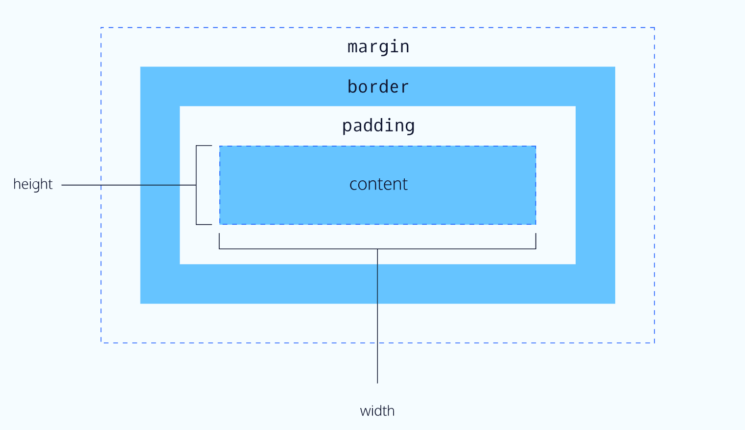

Height and Width
p { |
In this example, the height and width of paragraph elements are set to 80 pixels and 240 pixels, respectively — the px in the code above stands for pixels.
Pixels allow you to set the exact size of an element’s box (width and height). When the width and height of an element are set in pixels, it will be the same size on all devices — an element that fills a laptop screen will overflow [^3] a mobile screen.
[^3]:Defines how a block level element should handle content that goes beyond its boundaries.
Borders
6 min
A border is a line that surrounds an element, like a frame around a painting. Borders can be set with a specific width, style, and color:
width—The thickness of the border. A border’s thickness can be set in pixels or with one of the following keywords:thin,medium, orthick.style—The design of the border. Web browsers can render any of 10 different styles. Some of these styles include:none,dotted, andsolid.color—The color of the border. Web browsers can render colors using a few different formats, including 140 built-in color keywords.
p { |
In the example above, the border has a width of 3 pixels, a style of solid, and a color of coral. All three properties are set in one line of code.
The default border is medium none color, where color is the current color of the element. If width, style, or color are not set in the CSS file, the web browser assigns the default value for that property.
p.content-header { |
In this example, the border style is set to solid and the color is set to coral. The width is not set, so it defaults to medium.
Border Radius
3 min
Ever since we revealed the borders of boxes, you may have noticed that the borders highlight the true shape of an element’s box: square. Thanks to CSS, a border doesn’t have to be square.
You can modify the corners of an element’s border box with the border-radius property.
div.container { |
The code in the example above will set all four corners of the border to a radius of 5 pixels (i.e. the same curvature that a circle with a radius of 5 pixels would have).
You can create a border that is a perfect circle by first creating an element with the same width and height, and then setting the radius equal to half the width of the box, which is 50%.
div.container { |
The code in the example above creates a <div> that is a perfect circle.
Padding
6 min
The space between the contents of a box and the borders of a box is known as padding. Padding is like the space between a picture and the frame surrounding it. In CSS, you can modify this space with the padding property.
p.content-header { |
The code in this example puts 10 pixels of space between the content of the paragraph (the text) and the borders, on all four sides.
The padding property is often used to expand the background color and make the content look less cramped.
If you want to be more specific about the amount of padding on each side of a box’s content, you can use the following properties:
- Preview: Docs Defines the width of the top padding for an element.
padding-top - Preview: Docs Defines the width of the right padding for an element.
padding-right - Preview: Docs Loading link description
padding-bottom - Preview: Docs Defines the width of the left padding for an element.
padding-left
Each property affects the padding on only one side of the box’s content, giving you more flexibility in customization.
p.content-header { |
In the example above, only the bottom side of the paragraph’s content will have a padding of 10 pixels.
Padding Shorthand
5 min
Another implementation of the padding property lets you specify exactly how much padding there should be on each side of the content in a single declaration. A declaration that uses multiple properties as values is known as a shorthand property.
Padding shorthand lets you specify all of the padding properties as values on a single line:
- Preview: Docs Loading link description
padding-top - Preview: Docs Loading link description
padding-right - Preview: Docs Loading link description
padding-bottom - Preview: Docs Loading link description
padding-left
You can specify these properties in a few different ways:
4 Values
p.content-header { |
In the example above, the four values 6px 11px 4px 9px correspond to the amount of padding on each side, in a clockwise rotation. In order, it specifies the padding-top value (6px), the padding-right value (11px), the padding-bottom value (4px), and the padding-left value (9px) of the content.
3 Values
p.content-header { |
If the left and right sides of the content can be equal, the padding shorthand property allows for 3 values to be specified. The first value sets the padding-top value (5px), the second value sets the padding-left and padding-right values (10px), and the third value sets the padding-bottom value (20px).
2 Values
p.content-header { |
And finally, if the top and bottom sides can be equal, and the left and right sides can be equal, you can specify 2 values. The first value sets the padding-top and padding-bottom values (5px), and the second value sets the padding-left and padding-right values (10px).
Margin
4 min
So far you’ve learned about the following components of the box model: content, borders and padding. The fourth and final component of the box model is margin.
Margin refers to the space directly outside of the box. The margin property is used to specify the size of this space.
p { |
The code in the example above will place 20 pixels of space on the outside of the paragraph’s box on all four sides. This means that other HTML elements on the page cannot come within 20 pixels of the paragraph’s border.If you want to be even more specific about the amount of margin on each side of a box, you can use the following properties:
- Preview: Docs Loading link description
margin-top - Preview: Docs Loading link description
margin-right - Preview: Docs Loading link description
margin-bottom - Preview: Docs Defines the left margin area for an element.
margin-left
Each property affects the margin on only one side of the box, providing more flexibility in customization.
p { |
In the example above, only the right side of the paragraph’s box will have a margin of 15 pixels. It’s common to see margin values used for a specific side of an element.
Margin Shorthand
1 min
What if you don’t want equal margins on all four sides of the box and don’t have time to separate properties for each side? You’re in luck! Margin can be written as a shorthand property as well. The shorthand syntax for margins is the same as padding, so if you’re feeling comfortable with that, skip to the instructions. Otherwise, read on to learn how to use margin shorthand!
Similar to padding shorthand, margin shorthand lets you specify all of the margin properties as values on a single line:
- Preview: Docs Loading link description
margin-top - Preview: Docs Loading link description
margin-right - Preview: Docs Defines the bottom margin area for an element.
margin-bottom - Preview: Docs Loading link description
margin-left
You can specify these properties in a few different ways:
4 Values
p { |
In the example above, the four values 6px 10px 5px 12px correspond to the thickness of the margin on each side, in a clockwise rotation. In order, it specifies the margin-top value (6px), the margin-right value (10px), the margin-bottom value (5px), and the margin-left value (12px) of the content.
3 Values
p { |
If the left and right sides of the content can be equal, the margin shorthand property allows for 3 values to be specified. The first value sets the margin-top value (5px), the second value sets the margin-left and margin-right values (12px), and the third value sets the margin-bottom value (4px).
2 Values
p { |
And finally, if the top and bottom sides can be equal, and the left and right sides can be equal, you can specify 2 values. The first value sets the margin-top and margin-bottom values (20px), and the second value sets the margin-left and margin-right values (10px).
Margin Collapse
3 min
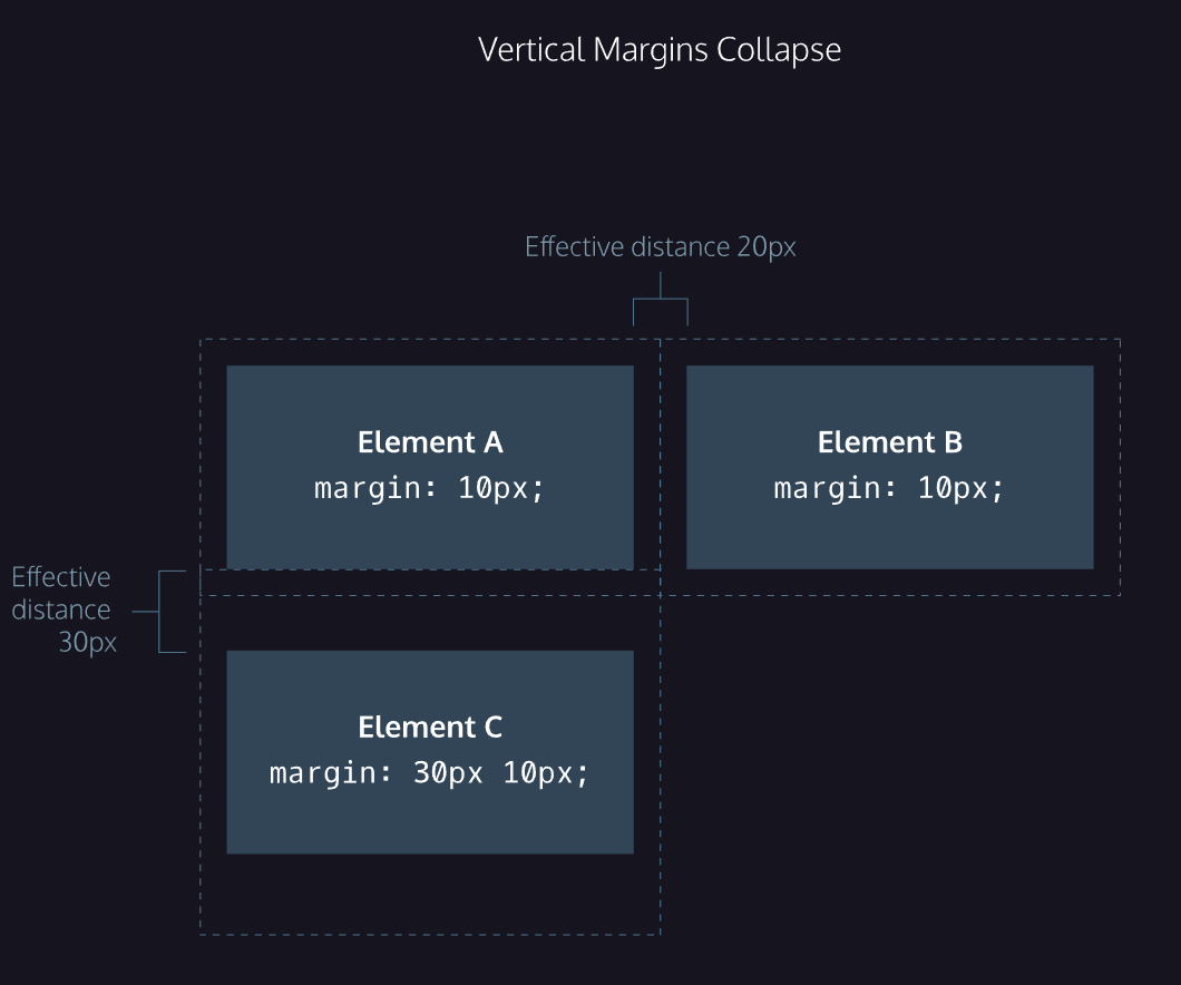
As you have seen, padding is space added inside an element’s border, while margin is space added outside an element’s border. One additional difference is that top and bottom margins, also called vertical margins, collapse, while top and bottom padding does not.
Horizontal margins (left and right), like padding, are always displayed and added together. For example, if two divs with ids #div-one and #div-two, are next to each other, they will be as far apart as the sum of their adjacent margins.
#img-one { |
In this example, the space between the #img-one and #img-two borders is 40 pixels. The right margin of #img-one (20px) and the left margin of #img-two (20px) add to make a total margin of 40 pixels.
Unlike horizontal margins, vertical margins do not add. Instead, the larger of the two vertical margins sets the distance between adjacent elements.
#img-one { |
In this example, the vertical margin between the #img-one and #img-two elements is 30 pixels. Although the sum of the margins is 50 pixels, the margin collapses so the spacing is only dependent on the #img-one bottom margin.
It may be helpful to think of collapsing vertical margins as a short person trying to push a taller person. The tall person has longer arms and can easily push the short person, while the person with short arms cannot reach the person with long arms.

Minimum and Maximum Height and Width
5 min
Because a web page can be viewed through displays of differing screen size, the content on the web page can suffer from those changes in size. To avoid this problem, CSS offers two properties that can limit how narrow or how wide an element’s box can be sized to:
min-width—this property ensures a minimum width of an element’s box.max-width—this property ensures a maximum width of an element’s box.
p { |
In the example above, the width of all paragraphs will not shrink below 300 pixels, nor will the width exceed 600 pixels.
Content, like text, can become difficult to read when a browser window is narrowed or expanded. These two properties ensure that content is legible by limiting the minimum and maximum widths of an element.
You can also limit the minimum and maximum height of an element:
min-height— this property ensures a minimum height for an element’s box.max-height— this property ensures a maximum height of an element’s box.
p { |
In the example above, the height of all paragraphs will not shrink below 150 pixels and the height will not exceed 300 pixels.
What will happen to the contents of an element’s box if the max-height property is set too low? It’s possible for the content to spill outside of the box, resulting in content that is not legible. You’ll learn how to work around this issue in the next exercise.
Overflow
5 min
All of the components of the box model comprise an element’s size. For example, an image that has the following dimensions is 364 pixels wide and 244 pixels tall.
- 300 pixels wide
- 200 pixels tall
- 10 pixels padding on the left and right
- 10 pixels padding on the top and bottom
- 2 pixels border on the left and right
- 2 pixels border on the top and bottom
- 20 pixels margin on the left and right
- 10 pixels margin on the top and bottom
The total dimensions (364px by 244px) are calculated by adding all of the vertical dimensions together and all of the horizontal dimensions together. Sometimes, these components result in an element that is larger than the parent’s containing area.
How can we ensure that we can view all of an element that is larger than its parent’s containing area?
The overflow property controls what happens to content that spills, or overflows, outside its box. The most commonly used values are:
hidden—when set to this value, any content that overflows will be hidden from view.scroll—when set to this value, a scrollbar will be added to the element’s box so that the rest of the content can be viewed by scrolling.visible—when set to this value, the overflow content will be displayed outside of the containing element. Note, this is the default value.
p { |
In the example above, if any of the paragraph content overflows (perhaps a user resizes their browser window), a scrollbar will appear so that users can view the rest of the content.
The overflow property is set on a parent element to instruct a web browser on how to render child elements. For example, if a div’s overflow property is set to scroll, all children of this div will display overflowing content with a scroll bar.
For a more in-depth look at overflow, including additional properties like overflow-x and overflow-y that separate out the horizontal and vertical values, head over to the MDN documentation.
Visibility
3 min
Elements can be hidden from view with the visibility property.
The visibility property can be set to one of the following values:
hidden— hides an element.visible— displays an element.collapse— collapses an element.
<ul> |
In the example above, the list item with a class of future will be hidden from view in the browser.
Keep in mind, however, that users can still view the contents of the list item (e.g., Donate) by viewing the source code in their browser. Furthermore, the web page will only hide the contents of the element. It will still leave an empty space where the element is intended to display.
Note: What’s the difference between display: none and visibility: hidden? An element with display: none will be completely removed from the web page. An element with visibility: hidden, however, will not be visible on the web page, but the space reserved for it will.
Review
Let’s take a minute to review what you learned:
- The box model comprises a set of properties used to create space around and between HTML elements.
- The height and width of a content area can be set in pixels or percentages.
- Borders surround the content area and padding of an element. The color, style, and thickness of a border can be set with CSS properties.
- Padding is the space between the content area and the border. It can be set in pixels or percent.
- Margin is the amount of spacing outside of an element’s border.
- Horizontal margins add, so the total space between the borders of adjacent elements is equal to the sum of the right margin of one element and the left margin of the adjacent element.
- Vertical margins collapse, so the space between vertically adjacent elements is equal to the larger margin.
margin: 0 autohorizontally centers an element inside of its parent content area, if it has a width.- The
overflowproperty can be set todisplay, hidden, or scroll, and dictates how HTML will render content that overflows its parent’s content area. - The
visibilityproperty can hide or show elements.
Changing the Box Model
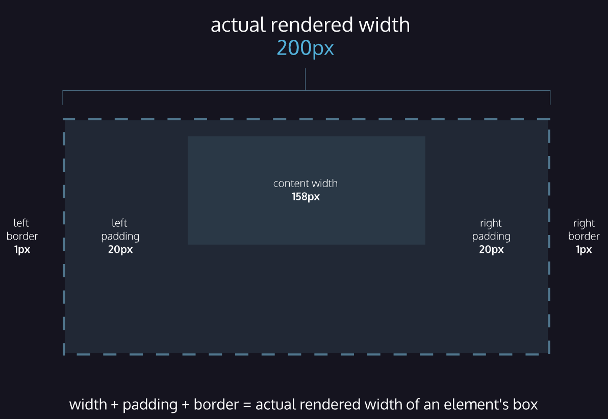
The last lesson focused on the most important aspects of the box model: box dimensions, boders, padding, and margin.
The box model however, has an awkward limitation regarding box dimensions. This limitation is best illustrated with an example.
<h1>Hello World</h1> |
In the example above, a heading element’s box has solid, black, 1 pixel thick borders. The height of the box is 200 pixels, while the width of the box is 300 pixels. A padding of 10 pixels has also been set on all four sides of the box’s content.
Unfortunately, under the current box model, the border thickness and the padding will affect the dimensions of the box.
The 10 pixels of padding increases the height of the box to 220 pixels and the width to 320 pixels. Next, the 1-pixel thick border increases the height to 222 pixels and the width to 322 pixels.
Under this box model, the border thickness and padding are added to the overall dimensions of the box. This makes it difficult to accurately size a box. Over time, this can also make all of a web page’s content difficult to position and manage.
In this brief lesson, you’ll learn how to use a different technique that avoids this problem altogether.
Box Model: Content-Box
1 min
Many properties in CSS have a default value and don’t have to be explicitly set in the stylesheet.
For example, the default font-weight of text is normal, but this property-value pair is not typically specified in a stylesheet.
The same can be said about the box model that browsers assume. In CSS, the box-sizing property controls the type of box model the browser should use when interpreting a web page.
The default value of this property is content-box. This is the same box model that is affected by border thickness and padding.
Box Model: Border-Box
2 min
Fortunately, we can reset the entire box model and specify a new one: border-box.
* { |
The code in the example above resets the box model to border-box for all HTML elements. This new box model avoids the dimensional issues that exist in the former box model you learned about.
In this box model, the height and width of the box will remain fixed. The border thickness and padding
will be included inside of the box, which means the overall dimensions of the box do not change.
<h1>Hello World</h1> |
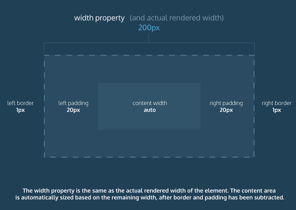
In the example above, the height of the box would remain at 150 pixels and the width would remain at 200 pixels. The border thickness and padding would remain entirely inside of the box.
Review: Changing the Box Model
Let’s review what you learned:
- In the default box model, box dimensions are affected by border thickness and padding.
- The
box-sizingproperty controls the box model used by the browser. - The default value of the
box-sizingproperty iscontent-box. - The value for the new box model is
border-box. - The
border-boxmodel is not affected by border thickness or padding.
Display and Positioning
Flow of HTML
1 min
A browser will render the elements of an HTML document that has no CSS from left to right, top to bottom, in the same order as they exist in the document. This is called the flow of elements in HTML.
In addition to the properties that it provides to style HTML elements, CSS includes properties that change how a browser positions elements. These properties specify where an element is located on a page, if the element can share lines with other elements, and other related attributes.
In this lesson, you will learn five properties for adjusting the position of HTML elements in the browser:
- position
- display
- z-index
- float
- clear
Each of these properties will allow us to position and view elements on a web page. They can be used in conjunction with any other styling properties you may know.
Position
4 min
Take a look at the block-level elements in the image below:

Block-level elements like these boxes create a block the full width of their parent elements, and they prevent other elements from appearing in the same horizontal space.
Notice the block-level elements in the image above take up their own line of space and therefore don’t overlap each other. In the browser to the right, you can see block-level elements also consistently appear on the left side of the browser. This is the default position for block-level elements.
The default position of an element can be changed by setting its position property. The position property can take one of five values:
In the next few exercises, you’ll learn about the values in the list above. For now, it’s important to understand that if you favor the default position of an HTML element, you don’t need to set its position property.
Position: Relative
4 min
One way to modify the default position of an element is by setting its position property to relative.
This value allows you to position an element relative to its default static position on the web page.
.green-box { |
Although the code in the example above instructs the browser to expect a relative positioning of the .green-box element, it does not specify where the .green-box element should be positioned on the page. This is done by accompanying the position declaration with one or more of the following offset properties that will move the element away from its default static position:
top- moves the element down from the top.bottom- moves the element up from the bottom.left- moves the element away from the left side (to the right).right- moves the element away from the right side (to the left).
You can specify values in pixels, ems, or percentages, among others, to dial in exactly how far you need the element to move. It’s also important to note that offset properties will not work if the element’s position property is the default static.
.green-box { |
In the example above, the element of green-box class will be moved down 50 pixels, and to the right 120 pixels, from its default static position. The image below displays the new position of the box.

Offsetting the relative element will not affect the positioning of other elements.
Position: Absolute
3 min
Another way of modifying the position of an element is by setting its position to absolute.
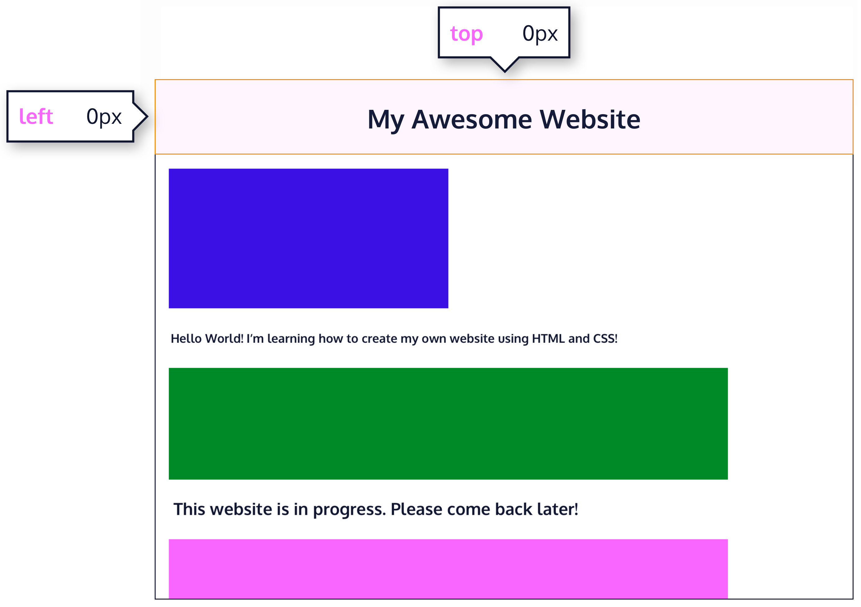
When an element’s position is set to absolute, all other elements on the page will ignore the element and act like it is not present on the page. The element will be positioned relative to its closest ancestor that has its position property set to anything other than static (e.g., relative, absolute, or fixed), and offset properties can be used to adjust its final position from that reference point. Take a look at the image below:

The “This website is in progress. Please come back later!” is displaced from its static position at the top left corner of its parent container, which is the main white area in the image. It is positioned using absolute positioning, with offset properties of top: 300px; and right: 0px; moving it 300 pixels down and aligning it with the right edge of the parent container. This absolute positioning causes other elements on the page to ignore it as if it is not part of the regular document flow.
Position: Fixed
4 min
When an element’s position is set to absolute, as in the last exercise, the element will scroll with the rest of the document when a user scrolls.
We can fix an element to a specific position on the page (regardless of user scrolling) by setting its position to fixed, and accompanying it with the familiar offset properties top, bottom, left, and right.
.title { |
In the example above, the .title element will remain fixed to its position no matter where the user scrolls on the page, like in the image below:
This technique is often used for navigation bars on a web page.
Position: Sticky
3 min
Since static and relative positioned elements stay in the normal flow of the document, when a user scrolls the page (or parent element) these elements will scroll too. And since fixed and absolute positioned elements are removed from the document flow, when a user scrolls, these elements will stay at their specified offset position.
The sticky value is another position value that keeps an element in the document flow as the user scrolls, but sticks to a specified position as the page is scrolled further. This is done by using the sticky value along with the familiar offset properties, as well as one new one.
.box-bottom { |
In the example above, the .box-bottom <div> will remain in its relative position, and scroll as usual. When it reaches 240 pixels from the top, it will stick to that position until it reaches the bottom of its parent container where it will “unstick” and rejoin the flow of the document.

在 CSS 中,position: sticky; 是一个非常强大的定位属性,它结合了 relative 和 fixed 两种定位模式的优点。简单来说,一个粘性定位的元素在特定滚动区域内表现为相对定位,但当它滚动到特定阈值时,就会“粘”在屏幕的某个位置,表现为固定定位。
Z-Index
4 min
When boxes on a web page have a combination of different positions, the boxes (and therefore, their content) can overlap with each other, making the content difficult to read or consume.
.blue-box { |
In the example above, the .green-box element overlaps on top of the .blue-box element.
The z-index property controls how far back or how far forward an element should appear on the web page when elements overlap. This can be thought of as the depth of elements, with deeper elements appearing behind shallower elements.
The z-index property accepts integer values. Depending on their values, the integers instruct the browser on the order in which elements should be layered on the web page.
.blue-box { |
In the example above, we set the .blue-box position to relative and the z-index to 1. We changed position to relative, because the z-index property does not work on static elements. The z-index of 1 moves the .blue-box element forward, because the z-index value has not been explicitly specified for the .green-box element, which means it has a default z-index value of 0. Take a look at the example image below:

Inline Display
5 min
Every HTML element has a default display value that dictates if it can share horizontal space with other elements. Some elements fill the entire browser from left to right regardless of the size of their content. Other elements only take up as much horizontal space as their content requires and can be directly next to other elements.
In this lesson, we’ll cover three values for the display property: inline, block, and inline-block.
The default display for some elements, such as <em>, <strong>, and <a>, is called inline. Inline elements have a box that wraps tightly around their content, only taking up the amount of space necessary to display their content and not requiring a new line after each element. The height and width of these elements cannot be specified in the CSS document. For example, the text of an anchor tag (<a>) will, by default, be displayed on the same line as the surrounding text, and it will only be as wide as necessary to contain its content. inline elements cannot be altered in size with the height or width CSS properties.
To learn more about <em>inline</em> elements, read <a href="#">MDN documentation</a>. |
In the example above, the <em> element is inline, because it displays its content on the same line as the content surrounding it, including the anchor tag. This example will display:
To learn more about inline elements, read MDN documentation.
The CSS display property provides the ability to make any element an inline element. This includes elements that are not inline by default such as paragraphs, divs, and headings.
h1 { |
The CSS in the example above will change the display of all <h1> elements to inline. The browser will render <h1> elements on the same line as other inline elements immediately before or after them (if there are any).
Display: Block
4 min
Some elements are not displayed in the same line as the content around them. These are called block-level elements. These elements fill the entire width of the page by default, but their width property can also be set. Unless otherwise specified, they are the height necessary to accommodate their content.
Elements that are block-level by default include all levels of heading elements (<h1> through <h6>), <p>, <div> and <footer>. For a complete list of block level elements, visit the MDN documentation.
strong { |
In the example above, all <strong> elements will be displayed on their own line, with no content directly on either side of them even though their contents may not fill the width of most computer screens.
Display: Inline-Block
5 min
The third value for the display property is inline-block. Inline-block display combines features of both inline and block elements. Inline-block elements can appear next to each other and we can specify their dimensions using the width and height properties. Images are the best example of default inline-block elements.
For example, the <div> s below will be displayed on the same line and with the specified dimensions:

Let’s take a look at the code:
<div class="rectangle"> |
There are three rectangular divs that each contain a paragraph of text. The .rectangle <div> s will all appear inline (provided there is enough space from left to right) with a width of 200 pixels and height of 300 pixels, even though the text inside of them may not require 200 pixels by 300 pixels of space.
Float
3 min
So far, you’ve learned how to specify the exact position of an element using offset properties. If you’re simply interested in moving an element as far left or as far right as possible in the container, you can use the float property.
The float property is commonly used for wrapping text around an image. Note, however, that moving elements left or right for layout purposes is better suited for tools like CSS
Preview: Docs Shorthand for setting multiple grid property values.grid and flexbox, which you’ll learn about later on.
The float property is often set using one of the values below:
left- moves, or floats, elements as far left as possible.right- moves elements as far right as possible.
.green-section { |
In the example above, we float the .orange-section element to the right. This works for static and relative positioned elements. See the result of the code below:

Floated elements must have a width specified, as in the example above. Otherwise, the element will assume the full width of its containing element, and changing the float value will not yield any visible results.
Clear
3 min
The float property can also be used to float multiple elements at once. However, when multiple floated elements have different heights, it can affect their layout on the page. Specifically, elements can “bump” into each other and not allow other elements to properly move to the left or right.
The clear property specifies how elements should behave when they bump into each other on the page. It can take on one of the following values:
left—the left side of the element will not touch any other element within the same containing element.right—the right side of the element will not touch any other element within the same containing element.both—neither side of the element will touch any other element within the same containing element.none—the element can touch either side.
div { |
In the example above, all <div> s on the page are floated to the left side. The element with class special did not move all the way to the left because a taller <div> blocked its positioning. By setting its clear property to left, the special <div> will be moved all the way to the left side of the page.
Color
Introduction to Color
1 min
CSS supports a wide variety of colors. These include named colors, like blue, black, and limegreen, along with colors described by a numeric value. Using a numeric system allows us to take advantage of the whole spectrum of colors that browsers support. In this lesson, we’re going to explore all the color options CSS offers.
Colors in CSS can be described in three different ways:
- Named colors — English words that describe colors, also called keyword colors
- RGB — numeric values that describe a mix of red, green, and blue
- HSL — numeric values that describe a mix of hue, saturation, and lightness
We’ll learn about and explore the benefits of each of these in-depth. Using only named colors, you may feel like you’re picking labeled crayons out of a box. By the end of this lesson, you’ll feel like a painter mixing paints on a palette.
Foreground vs Background
3 min
Before discussing the specifics of color, it’s important to make two distinctions about color. Color can affect the following design aspects:
- The foreground color
- The background color
Foreground color is the color that an element appears in. For example, when a heading is styled to appear green, the foreground color of the heading has been styled.
Conversely, when a heading is styled so that its background appears yellow, the background color of the heading has been styled
In CSS, these two design aspects can be styled with the following two properties:
color- this property styles an element’s foreground color.background-color- this property styles an element’s background color.
h1 { |
In the example above, the text of the heading will appear in red, and the background of the heading will appear blue.
Hexadecimal
5 min
One syntax that we can use to specify colors is called hexadecimal. Colors specified using this system are called hex colors. A hex color begins with a hash character (#) which is followed by three or six characters. The characters represent values for red, blue and green.
darkseagreen: #8FBC8F |
In the example above, you may notice that there are both letters and numbers in the values. This is because the hexadecimal number system has 16 digits (0-15) instead of 10 (0-9) like in the standard decimal system. To represent 10-15, we use A-F. Here is a list of many different colors and their hex values.
Notice that black, white, and aqua are all represented with both three characters and six characters. This can be done with hex colors whose number pairs are the same characters. In the example above, aqua can be represented as #0FF because both of the first two characters are 0 and the second and third pairs of characters are both F s. Keep in mind that all three character hex colors can be represented with six characters (by repeating each character twice) but the same is not true in reverse.
You can include hex colors just as you would include named colors: background-color: #9932cc;, and the letters can be uppercase or lowercase.
RGB Colors
2 min
There is another syntax for representing RGB values, commonly referred to as “RGB value” or just “RGB”, that uses decimal numbers rather than hexadecimal numbers, and it looks like this:
h1 { |
Each of the three values represents a color component, and each can have a decimal number value from 0 to 255. The first number represents the amount of red, the second is green, and the third is blue. These colors are exactly the same as hex, but with a different syntax and a different number system.
In general, hex and RGB color representations are equivalent. Which you choose is a matter of personal taste. That said, it’s good to choose one and be consistent throughout your CSS, because it’s easier to compare hex to hex and RGB to RGB.
Hex and RGB
3 min
The hexadecimal and rgb color system can represent many more colors than the small set of CSS named colors. We can use this new set of colors to refine our web page’s style.
In both hex and RGB, we have three values, one for each color. Each can be one of 256 values. Specifically, 256 * 256 * 256 = 16,777,216. That is the amount of colors we can now represent. Compare that to the roughly 140 named CSS colors!
Recall that we started with named colors, converted them to hex, and then converted some of the hex colors to rgb. Unless we made a mistake, all of the colors should still be the same, visually. Let’s use our broadened palette to make some more refined color choices.
Hue, Saturation, and Lightness
5 min
The RGB color scheme is convenient because it’s very close to how computers represent colors internally. There’s another equally powerful system in CSS called the hue-saturation-lightness color scheme, abbreviated as HSL.
The syntax for HSL is similar to the decimal form of RGB, though it differs in important ways. The first number represents the degree of the hue, and can be between 0 and 360. The second and third numbers are percentages representing saturation and lightness respectively. Here is an example:
color: hsl(120, 60%, 70%); |
Hue is the first number. It refers to an angle on a color wheel. Red is 0 degrees, Green is 120 degrees, Blue is 240 degrees, and then back to Red at 360. You can see an example of a color wheel below.

Saturation refers to the intensity or purity of the color. The saturation increases towards 100% as the color becomes richer. The saturation decreases towards 0% as the color becomes grayer.
Lightness refers to how light or dark the color is. Halfway, or 50%, is normal lightness. Imagine a sliding dimmer on a light switch that starts halfway. Sliding the dimmer up towards 100% makes the color lighter, closer to white. Sliding the dimmer down towards 0% makes the color darker, closer to black.
HSL is convenient for adjusting colors. In RGB, making the color a little darker may affect all three color components. In HSL, that’s as easy as changing the lightness value. HSL is also useful for making a set of colors that work well together by selecting various colors that have the same lightness and saturation but different hues.
Opacity and Alpha
4 min
All of the colors we’ve seen so far have been opaque, or non-transparent. When we overlap two opaque elements, nothing from the bottom element shows through the top element. In this exercise, we’ll change the opacity, or the amount of transparency, of some colors so that some or all of the bottom elements are visible through a covering element.
To use opacity in the HSL color scheme, use hsla instead of hsl, and four values instead of three. For example:
color: hsla(34, 100%, 50%, 0.1); |
The first three values work the same as hsl. The fourth value (which we have not seen before) is the alpha. This last value is sometimes called opacity.
Alpha is a decimal number from zero to one. If alpha is zero, the color will be completely transparent. If alpha is one, the color will be opaque. The value for half-transparent would be 0.5.
You can think of the alpha value as, “the amount of the background to mix with the foreground”. When a color’s alpha is below one, any color behind it will be blended in. The blending happens for each pixel; no blurring occurs.
The RGB color scheme has a similar syntax for opacity, rgba. Again, the first three values work the same as rgb and the last value is the alpha. Here’s an example:
color: rgba(234, 45, 98, 0.33); |
A little unconventional, but still worth mentioning is how hex colors can also have an alpha value. By adding a two-digit hexadecimal value to the end of the six-digit representation (#52BC8280), or a one-digit hexadecimal value to the end of the three-digit representation (#F003), you can change the opacity of a hexadecimal color. Hex opacity ranges from 00 (transparent) to FF (opaque).
Alpha can only be used with HSL, RGB, and hex colors; we cannot add the alpha value to name colors like green.
There is, however, a named color keyword for zero opacity, transparent. It’s equivalent to rgba(0, 0, 0, 0), and it’s used like any other color keyword:
color: transparent; |
Typography
Font Family
7 min
You may remember from the Visual Rules lesson that the font of an element can be changed using the font-family property.
h1 { |
In the example above, the font family for all <h1> heading elements have been set to Arial.
Let’s talk about some things to keep in mind when setting font-family values.
Multi-Word Values
When specifying a typeface with multiple words, like Times New Roman, it is recommended to use quotation marks (' ') to group the words together, like so:
h1 { |
Web Safe Fonts
There is a selection of fonts that will appear the same across all browsers and operating systems. These fonts are referred to as web safe fonts. You can check out a complete list of web safe fonts here.
Fallback Fonts and Font Stacks
Web safe fonts are good fallback fonts that can be used if your preferred font is not available.
h1 { |
In the example above, Georgia and Times New Roman are fallback fonts to Caslon. When you specify a group of fonts, you have what is known as a font stack. A font stack usually contains a list of similar-looking fonts. Here, the browser will first try to use the Caslon font. If that’s not available, it will try to use a similar font, Georgia. And if Georgia is not available, it will try to use Times New Roman.
Serif and Sans-Serif
You may be wondering what features make a font similar to another font. The fonts Caslon, Georgia, and Times New Roman are Serif fonts. Serif fonts have extra details on the ends of each letter, as opposed to Sans-Serif fonts, which do not have the extra details.

serif and sans-serif are also keyword values that can be added as a final fallback font if nothing else in the font stack is available.
h1 { |
In this final example, the font stack has 4 fonts. If the first 3 fonts aren’t available, the browser will use whatever serif font is available on the system.
Font Weight
3 min
In CSS, the
Preview: Docs Loading link description font-weight
property controls how bold or thin text appears. It can be specified with keywords or numerical values.
Keyword Values
The font-weight property can take any one of these keyword values:
bold: Bold font weight.normal: Normal font weight. This is the default value.lighter: One font weight lighter than the element’s parent value.bolder: One font weight bolder than the element’s parent value
Numerical Values
Numerical values can range from 1 (lightest) to 1000 (boldest), but it is common practice to use increments of 100. A font weight of 400 is equal to the keyword value normal, and a font weight of 700 is equal to bold.
.left-section { |
In the example above, text in elements of both .left-section and .right-section classes will appear bold.
It’s important to note that not all fonts can be assigned a numeric font weight, and not all numeric font weights are available to all fonts. It’s a good practice to look up the font you are using to see which font-weight values are available.
Font Style
2 min
You can also italicize text with the
Preview: Docs Loading link description font-style
property.
h3 { |
The italic value causes text to appear in italics. The font-style property also has a normal value which is the default.
Text Transformation
2 min
Text can also be styled to appear in either all uppercase or lowercase with the text-transform property.
h1 { |
The code in the example above formats all <h1> elements to appear in uppercase, regardless of the case used for the heading within the HTML code. Alternatively, the lowercase value could be used to format text in all lowercase.
Since text can be directly typed in all uppercase or lowercase within an HTML file, what is the point of a CSS rule that allows you to format letter case?
Depending on the type of content a web page displays, it may make sense to always style a specific element in all uppercase or lowercase letters. For example, a website that reports breaking news may decide to format all <h1> heading elements such that they always appear in all uppercase, as in the example above. It would also avoid uppercase text in the HTML file, which could make code difficult to read.
Text Layout
6 min
You’ve learned how text can be defined by font family, weight, style, and transformations. Now you’ll learn about some ways text can be displayed or laid out within the element’s container.
Letter Spacing
The letter-spacing property is used to set the horizontal spacing between the individual characters in an element. It’s not common to set the spacing between letters, but it can sometimes help the readability of certain fonts or styles. The letter-spacing property takes length values in units, such as 2px or 0.5em.
p { |
In the example above, each character in the paragraph element will be separated by 2 pixels.
Word Spacing
You can set the space between words with the word-spacing property. It’s also not common to increase the spacing between words, but it may help enhance the readability of bolded or enlarged text. The word-spacing property also takes length values in units, such as 3px or 0.2em.
h1 { |
In the example above, the word spacing is set to 0.3em. For word spacing, using em values are recommended because the spacing can be set based on the size of the font.
Line Height

We can use the line-height property to set how tall we want each line containing our text to be. Line height values can be a unitless number, such as 1.2, or a length value, such as 12px, 5% or 2em.
p { |
In the example above, the height between lines is set to 1.4. Generally, the unitless value is preferred since it is responsive based on the current font size. In other words, if the line-height is specified by a unitless number, changing the font size will automatically readjust the line height.
Text Alignment
The text-align property, which you may already be familiar with from the CSS Visual Rules lesson, aligns text to its parent element.
h1 { |
In the example above, the <h1> element is aligned to the right side, instead of the default left.
Web Fonts
1 min
Previously, we learned about web safe fonts, a group of fonts supported across browsers and operating systems. However, the fonts you can use for your website are limitless—web fonts allow you to express your unique style through a multitude of different fonts found on the web.
Free font services, like Google Fonts and Adobe Fonts, host fonts that you can link to from your HTML document with a provided <link> element.
You can also use fonts from paid font distributors like fonts.com by downloading and hosting them with the rest of your site’s files. You can create a @font-face ruleset in your CSS stylesheet to link to the relative path of the font file.
Both techniques for including web fonts into your site allow you to go beyond the sometimes “traditional” appearance of web safe fonts. In the next two exercises, you’ll learn exactly how to use each of these techniques!
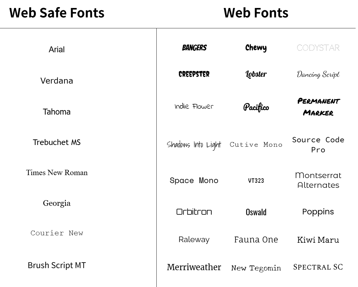
Web Fonts Using < link >
7 min
Online font services, like Google Fonts, make it easy to find and link to fonts from your site. You can browse and select fonts that match the style of your website.

When you select a font in Google Fonts, you’ll be shown all of the different styles available for that particular font. You can then select the styles you want to use on your site.

When you’re done selecting a font and its styles, you can review your selected font family, and a <link> element will be automatically generated for you to use on your site!
<head> |
The generated <link> element needs to be added to the <head> element in your HTML document for it to be ready to be used in your CSS.
p { |
You can then create font-family declarations in your CSS, just like how you learned to do with other fonts!
Web Fonts Using @font-face
12 min
Fonts can also be added using a @font-face ruleset in your CSS stylesheet instead of using a <link> element in your HTML document. As mentioned earlier, fonts can be downloaded just like any other file on the web. They come in a few different file formats, such as:
- OTF (OpenType Font)
- TTF (TrueType Font)
- WOFF (Web Open Font Format)
- WOFF2 (Web Open Font Format 2)
The different formats are a progression of standards for how fonts will work with different browsers, with WOFF2 being the most progressive. It’s a good idea to include TTF, WOFF, and WOFF2 formats with your @font-face rule to ensure compatibility on all browsers.
Let’s take a look at how to use @font-face using the same Roboto font as before:

Within the “Selected Families” section, you can use the “Download” button to download the font files to your computer. The files will be downloaded in a single format, in this case, TTF. You can use additional tools to generate additional file types for WOFF and WOFF2, check out MDN’s list of font generators for more information.
When you have the files you need, move them to a folder inside your website’s working directory, and you’re ready to use them in a @font-face ruleset!
@font-face { |
Let’s take a look at the example above, line by line:
- The
@font-faceat-rule is used as the selector. It’s recommended to define the@font-faceruleset at the top of your CSS stylesheet. - Inside the declaration block, the
font-familyproperty is used to set a custom name for the downloaded font. The name can be anything you choose, but it must be surrounded by quotation marks. In the example, the font is named'MyParagraphFont', as this font will be used for all paragraphs. - The
srcproperty contains three values, each specifying the relative path to the font file and its format. In this example, the font files are stored inside a folder namedfontswithin the working directory. - Note that the ordering for the different formats is important because our browser will start from the top of the list and search until it finds a font format that it supports. Read more on format prioritization on CSS-Tricks.
Once the @font-face at-rule is defined, you can use the font in your stylesheet!
p { |
Like using any other fonts, you can use the font-family property to set the font on any HTML element. The downloaded font can be referenced with the name you provided as the font-family property’s value in the @font-face ruleset—in this case, 'MyParagraphFont'.
Review
Let’s review what you’ve learned so far:
- Typography is the art of arranging text on a page.
- Text can appear bold or thin with the
font-weightproperty. - Text can appear in italics with the
font-styleproperty. - The vertical spacing between lines of text can be modified with the
line-heightproperty. - Serif fonts have extra details on the ends of each letter. Sans-Serif fonts do not.
- Fallback fonts are used when a certain font is not installed on a user’s computer.
- The
word-spacingproperty changes how far apart individual words are. - The
letter-spacingproperty changes how far apart individual letters are. - The
text-alignproperty changes the horizontal alignment of text. - Google Fonts provides free fonts that can be used in an HTML file with the
<link>tag or the@font-faceproperty. - Local fonts can be added to a document with the
@font-faceproperty and the path to the font’s source.
Full Stack Open University of Helsinki 2026
Tools
- Many tools exist for making the testing of backends easier. One of these is a command line program curl. However, instead of curl, we will take a look at using Postman for testing the application.
Fullstack part2
Adding styles to React app
The second parameter of useEffect is used to specify how often the effect is run. The principle is that the effect is always executed after the first render of the component and when the value of the second parameter changes.
useEffect(() => { |
Fullstack part4
Project structure
So what are these router objects exactly? The Express manual provides the following explanation:
A router object is an isolated instance of middleware and routes. You can think of it as a “mini-application,” capable only of performing middleware and routing functions. Every Express application has a built-in app router.
The router is in fact a middleware, that can be used for defining “related routes” in a single place, which is typically placed in its own module.
[Note on export](Fullstack part4 | Structure of backend application, introduction to testing)
Finding the usages of your exports with VS Code
VS Code has a handy feature that allows you to see where your modules have been exported. This can be very helpful for refactoring. For example, if you decide to split a function into two separate functions, your code could break if you don’t modify all the usages. This is difficult if you don’t know where they are. However, you need to define your exports in a particular way for this to work.
If you right-click on a variable in the location it is exported from and select “Find All References”, it will show you everywhere the variable is imported. However, if you assign an object directly to module.exports, it will not work. A workaround is to assign the object you want to export to a named variable and then export the named variable. It also will not work if you destructure where you are importing; you have to import the named variable and then destructure, or just use dot notation to use the functions contained in the named variable.
The nature of VS Code bleeding into how you write your code is probably not ideal, so you need to decide for yourself if the trade-off is worthwhile.
Optimizing the beforeEach function
beforeEach(async () => { |
The Promise.all method can be used for transforming an array of promises into a single promise, that will be fulfilled once every promise in the array passed to it as an argument is resolved. The last line of code await Promise.all(promiseArray) waits until every promise for saving a note is finished, meaning that the database has been initialized.
The returned values of each promise in the array can still be accessed when using the Promise.all method. If we wait for the promises to be resolved with the await syntax const results = await Promise.all(promiseArray), the operation will return an array that contains the resolved values for each promise in the promiseArray, and they appear in the same order as the promises in the array.
Promise.all executes the promises it receives in parallel. If the promises need to be executed in a particular order, this will be problematic. In situations like this, the operations can be executed inside of a for…of block, that guarantees a specific execution order.
beforeEach(async () => { |
Fullstack part4 | User administration
const mongoose = require('mongoose') |
However, we want to be careful when using the uniqueness index. If there are already documents in the database that violate the uniqueness condition, no index will be created. So when adding a uniqueness index, make sure that the database is in a healthy state! The test above added the user with username root to the database twice, and these must be removed for the index to be formed and the code to work.
Fullstack part4 | User administration
As previously mentioned, document databases do not properly support join queries between collections, but the Mongoose library can do some of these joins for us. Mongoose accomplishes the join by doing multiple queries, which is different from join queries in relational databases which are transactional, meaning that the state of the database does not change during the time that the query is made. With join queries in Mongoose, nothing can guarantee that the state between the collections being joined is consistent, meaning that if we make a query that joins the user and notes collections, the state of the collections may change during the query.
Fullstack part4 | Token authentication
The shorter the expiration time, the safer the solution is. If the token falls into the wrong hands or user access to the system needs to be revoked, the token is only usable for a limited amount of time. However, a short expiration time is a potential pain point for the user, as it requires them to log in more frequently.
The other solution is to save info about each token to the backend database and to check for each API request if the access rights corresponding to the tokens are still valid. With this scheme, access rights can be revoked at any time. This kind of solution is often called a server-side session.
The negative aspect of server-side sessions is the increased complexity in the backend and also the effect on performance since the token validity needs to be checked for each API request to the database. Database access is considerably slower compared to checking the validity of the token itself. That is why it is quite common to save the session corresponding to a token to a key-value database such as Redis, that is limited in functionality compared to eg. MongoDB or a relational database, but extremely fast in some usage scenarios.
When server-side sessions are used, the token is quite often just a random string, that does not include any information about the user as it is quite often the case when jwt-tokens are used. For each API request, the server fetches the relevant information about the identity of the user from the database. It is also quite usual that instead of using Authorization-header, cookies are used as the mechanism for transferring the token between the client and the server.
Fullstack part5 | props.children and proptypes
Sometimes, you want the state of two components to always change together. To do it, remove state from both of them, move it to their closest common parent, and then pass it down to them via props. This is known as lifting state up, and it’s one of the most common things you will do writing React code.
Fullstack part5
Fullstack part5 | Testing React apps
It is, however, recommended to search for elements primarily using methods other than the container object and CSS selectors. CSS attributes can often be changed without affecting the application’s functionality, and users are not aware of them. It is better to search for elements based on properties visible to the user, for example, by using the getByText method. This way, the tests better simulate the actual nature of the component and how a user would find the element on the screen.